
With a deep understanding of spatial navigation, I’ve honed the art of creating clear, memorable pathways. At Curvspace, we design transitional areas that serve as intuitive landmarks. This article discusses how well-planned intermediate spaces can establish a strong spatial identity and guide movement effortlessly. This design strategy for pathway pointers and wayfinding design is crucial for creating environments that feel intuitive. Good landmark design and attention to transitional spaces are key to achieving clear navigation.
Jump to:
The Soul of a Space: Deconstructing Spatial Identity
Have you ever walked into a building and just felt… right? You knew where to go without consciously thinking about it. Conversely, have you ever felt hopelessly lost in a space that should have been simple, a feeling of mild panic rising as you search for a single clue? The difference between these two experiences often comes down to a powerful, yet often overlooked, concept: spatial identity.
Beyond a Location: What is Spatial Identity?
Spatial identity isn’t just about an address or a set of coordinates. It’s the complex, layered relationship we form with our physical surroundings. It’s the emotional, psychological, and social connection that transforms a mere “space” into a “place”. Think of your childhood home, a favorite park, or that one café where you feel instantly at ease. These places have a strong identity for you because they are woven into the fabric of your experiences, memories, and sense of self.
This identity is not a fixed label an architect slaps on a blueprint; it’s a dynamic and living thing, constantly shaped by cultural backgrounds, personal histories, and social interactions. Architecture may provide the physical form, but it’s the user’s perception and movement that breathes life and meaning into it. The architect initiates a conversation with the design, but the building’s true identity is only realized in its use and reception by the people within it.
The Self and the Surroundings: How Space Shapes Us
The spaces we inhabit have a profound effect on our self-perception. When we feel a strong connection to a place, it can enhance our sense of belonging, boost our confidence, and contribute to our overall well-being. This is why a well-designed public square can foster a sense of community, while a poorly designed one can feel alienating and unsafe.
Several factors contribute to this positive connection:
- A Sense of Belonging: Feeling connected to a community or a place validates our identity within that group.
- Cultural Heritage: Spaces that engage with cultural history can instill a sense of pride and connection to our roots. Think of the way indigenous cultures express their identity through their deep connection to ancestral lands.
- Environmental Quality: Clean, safe, and aesthetically pleasing environments simply make us feel better, enhancing our self-perception.
When a community shares a spatial identity, it creates powerful social bonds. Shared memories of a place can unite people, motivating them to work together for common goals. It is this shared identity that turns a collection of houses into a neighborhood.
The Architect’s Whisper: Intention vs. Reception
As a designer, I am acutely aware that my vision is only the starting point. I can imbue a space with intentions—for it to be welcoming, efficient, or inspiring—but its final identity is determined by how people actually experience it. There can be a significant gap between the constructed identity and the received one.
This is why a user-centered approach is not just a buzzword; it’s the very foundation of successful design. We must consider the patterns of movement, the lines of sight, and the perceptual journey of the user. We’re not just designing buildings; we’re designing experiences. We’re crafting the framework within which memories will be made and identities will be formed.
The Unseen Choreography: Wayfinding as a Design Discipline

When people hear the term “wayfinding design,” they often picture signs. Arrows, directories, room numbers. And while that’s part of it, it’s also the most superficial layer. True wayfinding is a far deeper and more integrated discipline. It’s the art and science of helping people navigate a space comfortably and confidently, often without them even noticing they’re being guided.
More Than Just Signs: A Holistic View of Wayfinding
Let me challenge a common assumption: the goal of a great wayfinding system is not to add more signs. In fact, it’s often to have as few as possible. As expert Cody Clark puts it, “If we did our job right, there’s only a minimal amount of wayfinding needed.”. Why? Because the environment itself should do most of the work. The architecture, the landscape, the lighting, the strategic placement of a brightly colored wall or a magnificent tree—these are the most powerful wayfinding tools we have.
Wayfinding is about creating an emotional connection, a sense of comfort and safety that empowers people to explore, discover, and experience a place without anxiety. It’s a holistic system where every element works in concert to tell a coherent story about the space. It’s an anticipatory dance between the designer and the user; you are always guiding them toward what’s next.

Active vs. Passive Guidance: The Gentle Nudge
It helps to think about wayfinding in two categories: active and passive.
- Active Wayfinding involves adding formal components to the environment to aid orientation. This is where your signs, maps, and directories come in. They are explicit instructions.
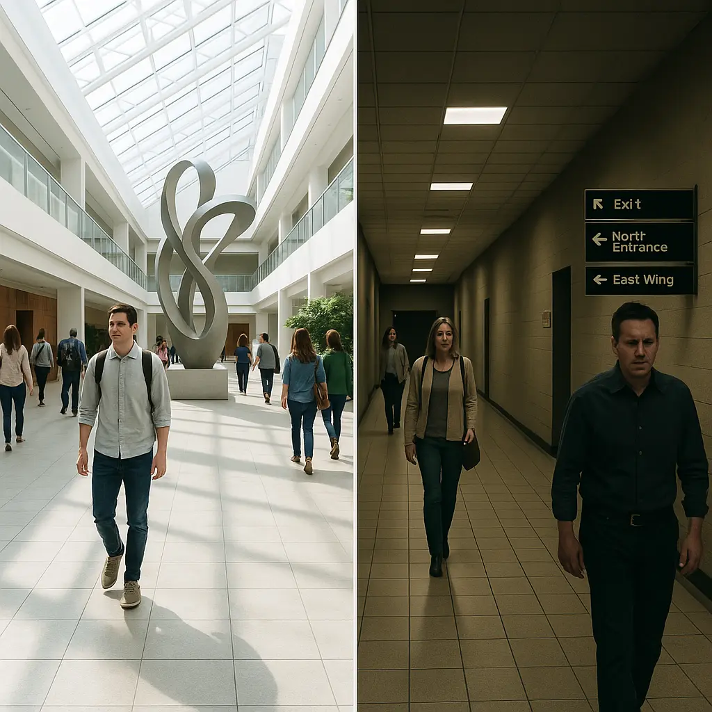
- Passive Wayfinding is more subtle and intuitive. It uses the environment itself to guide people. Think of a grand, welcoming entrance that is clearly the main point of entry, logical pathways that lead you naturally to key areas, or a change in flooring material that signals a transition to a new zone.
At Curvspace, we believe the most elegant solutions are born from a seamless blend of both, with a strong emphasis on the passive. When the architecture itself is logical and legible, the need for active signage diminishes. The goal is to create a space that communicates its own layout intuitively, so navigation feels effortless.
The Cognitive Journey: How Our Brains Navigate
To design for navigation, we must first understand how people think. Neuroscientist Alain Berthoz identifies several cognitive strategies we use to find our way, two of which are particularly relevant. The first is an “egocentric” strategy, where we construct the world as a sequence of viewpoints, remembering turns and movements relative to our own body (“go left at the sculpture”). The second is an “allocentric” strategy, where we build a mental map of the space and understand our position within that larger system, like a bird’s-eye view.
A brilliant wayfinding system supports both strategies. It provides clear landmarks for the egocentric navigator to latch onto, while the logical layout helps the allocentric navigator build a coherent mental map. By understanding this cognitive journey, we can move beyond simply placing signs and start designing for the very process of human spatial reasoning.
The Power of the Pause: Designing Effective Pathway Pointers

So, how do we create this intuitive, passive guidance? We do it through a series of carefully designed “pathway pointers.” This is a term I use to encompass any element—be it architectural, artistic, informational, or natural—that serves to clarify a path, mark a decision point, and reinforce the overarching spatial identity of a place.
The Hierarchy of Cues: From Landmarks to Textures
Legendary urban planner Kevin Lynch gave us a foundational vocabulary for understanding how we read a city, and it applies perfectly to buildings and complexes. He identified five key elements that help us form mental maps:
- Paths: These are the channels along which we move. Corridors, sidewalks, transit lines. They are the dominant element for most people. The key is to make them well-structured and logical.
- Edges: These are the boundaries between two areas, like a wall, a shoreline, or a row of buildings. They help us define and orient districts.
- Districts: These are sections of a space that have a common, identifiable character. We recognize we are “in” a district. This can be achieved through consistent architectural style, color palettes, or functions.
- Nodes: These are the strategic points in a space that we can enter, typically major intersections or points where we have to make a navigational decision. Lobbies and plazas are classic nodes. They are the best places to deliver key information because people naturally pause there.
- Landmarks: These are point-references that are external to the observer. Unlike a node, we don’t enter a landmark; we orient ourselves by it. A distinctive building, a sculpture, a fountain—these are landmarks.
A successful wayfinding system uses all five of these elements in harmony to create a rich and understandable environmental image.
The Art of the Landmark: Creating Memorable Beacons
Of all these elements, landmarks are perhaps the most powerful pathway pointers. A good landmark serves as a reliable anchor in our mental map, a point we can always return to if we get lost. But what makes a good landmark? It’s more than just being big.
- Distinctiveness: A landmark must stand out from its surroundings. A generic pine tree is a poor landmark because it looks like every other pine tree. But a single, ancient, gnarled oak is highly distinctive. Similarly, a unique sculpture or a water feature can be a powerful landmark in a corporate campus.
- Visibility and Asymmetry: The landmark should be visible from many directions, and it should look different from different angles. A perfectly symmetrical object can be confusing because you can’t tell which side you’re looking at. An asymmetrical landmark, however, provides clear orientation cues.
- Strategic Placement: Landmarks are most effective when placed at key decision points or nodes. An unexpected sculpture placed where a corridor splits into two options provides a memorable association for the choice made.
- Aesthetic and Emotional Resonance: The most effective landmarks do more than just orient; they connect with us. They are often beautiful, interesting, or meaningful. The transformation of a simple structure, like a bridge, into an icon often happens when high aesthetic quality is combined with its engineering. This blend of form, color, and texture is what turns an object into a true landmark design.
Transitional Spaces: The Connective Tissue of Experience
If landmarks are the anchors of a space, transitional spaces are the currents that connect them. These are the “in-between” places: the corridors, lobbies, courtyards, staircases, and entrances that bridge our journey from one destination to another. For too long, these areas have been treated as afterthoughts—mere conduits for circulation. But at Curvspace, we see them as central to the user experience. They are not just hallways; they are “spatial opportunities”.
Not Just a Hallway: The Potential of “In-Between” Spaces
A transitional space is defined by its sequence; it’s a dynamic space that has to be walked through to be understood. It’s the pause before the performance, the journey that builds anticipation for the destination. These spaces are uniquely flexible because they often lack a single, prescribed function, allowing them to adapt to the needs of the user. A wide corridor can become an informal meeting spot. A courtyard can be a place for quiet reflection or a bustling social hub. A lobby is not just an entry point; it’s the first handshake the building gives you, a place to pause, orient, and decide your next move.
Designing the Sequence: A Choreography of Movement
Designing effective transitional spaces is like choreographing a dance. We must carefully consider the sequence of experience, using architectural elements to channel and simplify movement. How does the quality of light change as you move from a compressed entryway into a soaring atrium? How does the flooring material shift to signal your arrival in a new zone?
We can use a rich palette of architectural elements to define these transitions:
- Colonnades and Aisles: As seen in Connaught Place in New Delhi, a colonnade creates a beautiful semi-enclosed transition between the bustling street and the quiet interior.
- Courtyards: In traditional South Indian homes, the nalukettu (courtyard) acts as a central transition space, bridging private rooms with a semi-open, communal area connected to nature.
- Changes in Level: A few steps up or down, or even a simple transition strip between two different flooring materials, can create a powerful psychological threshold between spaces.
- Openings: The design of a doorway or arch can frame the view of the space beyond, building anticipation and clarifying the transition from one area to another.
Bridging Worlds: Transitions Between Inside and Out, Public and Private
Transitional spaces are masters at mediating relationships: between inside and outside, public and private, nature and the built form. A veranda is the classic example, offering both the security of the indoors and the openness of the outdoors. Balconies and terraces serve a similar function, acting as personal thresholds to the world outside. This focus on balancing nature and built form is a core tenet of our work at Curvspace, creating eco-transitions that serve as refreshing microclimates and gentle bridges between worlds.

A Practical Design Strategy for Clear Navigation

Creating a space with a clear spatial identity and intuitive clear navigation doesn’t happen by accident. It requires a thoughtful and rigorous design strategy that is user-focused from the very beginning.
Start with Why: The Strategy Document
Before a single line is drawn, the first step should always be creating a strategy document. This foundational plan forces you to answer the most important questions:
- Who are the users of this space? What are their needs, goals, and potential anxieties?
- What are the key destinations and decision points?
- What is the story we want this space to tell? What is its intended identity?
- What are the client’s goals and objectives for the project?
This document becomes the North Star for the entire design process, ensuring that every decision, from the grand architectural gesture to the choice of font on a sign, is aligned with a clear, strategic purpose.
Lessons from the Masters: Two Philosophies of Clarity
To inspire your own approach, consider two titans of 20th-century graphic design whose philosophies offer a fascinating lens through which to view wayfinding.
On one hand, you have Massimo Vignelli, the Italian modernist maestro behind the iconic New York City Subway map and the American Airlines identity. Vignelli was a champion of objectivity, clarity, and systematic design. His approach was about reducing a complex system to its most essential, logical elements. A “Vignelli” wayfinding system would be characterized by a strict grid, a limited and highly functional color palette, and pristine, sans-serif typography. It is the pinnacle of rational, uncluttered guidance.
On the other hand, you have Milton Glaser, the creator of the exuberant “I ♥ NY” logo. Glaser rejected the rigidity of pure modernism, embracing ornamentation, narrative, and visual ambiguity. He believed design could be expressive, eclectic, and emotionally potent. A “Glaser” wayfinding system would be more experiential, perhaps using illustrative murals, historical typography, and rich storytelling elements to guide people. It is guidance as narrative and delight.
So, I ask you: is your space a Vignelli or a Glaser? Does it call for disciplined, systematic clarity, or for expressive, narrative-driven experience? The truth, for most projects, lies in a creative fusion of both.
The Designer’s Toolkit: Color, Typography, and Hierarchy
Once the philosophy is set, we turn to the tools. Drawing lessons from the hyper-refined world of digital user experience design, we know that consistency is paramount.
- Color: Color is one of the most effective and cost-efficient ways to simplify a wayfinding system. Color-coding different floors, wings, or departments is a simple way to create instant differentiation, overcoming language and cultural barriers.
- Typography: Fonts must be legible from a distance, with clear contrast against their background. The hierarchy of information—what is most important vs. what is secondary—should be immediately obvious through the use of size, weight, and spacing.
- Hierarchy: Visual cues guide a user’s attention. The most important information should be the most visually prominent. This applies to the layout of a sign, the placement of a landmark, and the design of a building’s entrance.
Prototyping the Path: From Sketches to Virtual Reality
In the past, we relied on blueprints and physical models to test our designs. Today, technology allows for a much more dynamic and user-centric process. We can use 3D rendering and virtual reality (VR) to “walk through” a space before it’s ever built. This allows us to test sightlines, check the legibility of signage from different distances, and iteratively refine the navigational flow based on simulated user experiences. This ability to test, learn, and improve is invaluable in creating a system that truly works for the people who will use it.
Case Studies in Spatial Identity
Theory is valuable, but seeing these principles in action is where the real learning happens. Let’s look at a few world-class examples of how wayfinding and spatial identity have been masterfully handled.
The Grand Dame: Taming the Louvre’s Labyrinth
The Louvre in Paris presents a monumental wayfinding challenge: a vast, labyrinthine palace containing a collection that spans millennia. To prevent visitors from being completely overwhelmed, they implemented a multi-tiered system. The museum is clearly segmented into sections, allowing visitors to navigate between eras and regions. The iconic glass pyramid serves as the central reference point—the ultimate landmark—with all major pathways leading to or from it. This is supplemented with interactive digital maps, blending active and passive wayfinding into a cohesive whole.
The Whisper of History: Wayfinding in the Alhambra
At the Alhambra in Spain, a UNESCO World Heritage site, the challenge was the opposite: how to introduce modern wayfinding without disrupting the sublime historical aesthetic. The solution was one of subtlety and respect. Minimalistic signage designed to blend with the ancient architecture was paired with subtle ground markers to guide visitors. Interactive digital guides on personal devices provide deep historical context without cluttering the physical space, turning a simple tour into an immersive historical experience. It’s a masterclass in respecting a site’s powerful existing identity.

The City as a System: Four Models of Urban Wayfinding
Referencing David Gibson’s The Wayfinding Handbook, we can see these strategies at a macro scale in the world’s great cities. We often adapt these models for large-scale projects:
- The Connector Model (Beijing’s Forbidden City): Characterized by a strong central axis and a concentric system of gateways that clearly lead the way. It’s linear and hierarchical.
- The Districts Model (Cambridge, England): A city that evolved organically, relying on distinct precincts with their own names, character, and gateways to provide orientation.
- The Landmarks Model (Rome): This ancient city uses major civic landmarks as focal points at the center of intersections, connected by axial roads. You navigate from one spectacular landmark to the next.
- The Streets Model (New York City): A simple, powerful system using a sequentially numbered grid of streets. The system itself is the wayfinding tool.
By understanding these archetypal models, we can choose the most relevant approach for a new project, or even combine models to make a complex space more digestible.
People Also Ask
What is the difference between wayfinding and signage?
Wayfinding is the holistic system used to navigate a space, encompassing architecture, landscape, lighting, landmarks, and spatial planning. Signage is just one tool within that larger system—an active component designed to provide explicit information like maps and directions. Great wayfinding aims to make the environment so intuitive that minimal signage is needed.
How can I improve wayfinding in an existing building without a major renovation?
Focus on high-impact, low-cost changes. Implementing a clear color-coding system for different floors or departments is highly effective. Improve lighting in key corridors and decision points. Use strategic placement of art, plants, or distinctive furniture to create new, memorable landmarks. Finally, ensure existing directories are clear, simple, and located at primary nodes like entrances and elevator banks.
What makes a landmark effective for navigation?
An effective landmark is, above all, distinctive and memorable. It should be clearly visible from multiple approaches and ideally asymmetrical, so it looks different from different sides, which aids orientation. Most importantly, it should be located at a key decision point, such as an intersection or entrance, where people need to make a choice about their path.
Conclusion
Designing pathways is about so much more than showing people the way. It’s about crafting a narrative, choreographing an experience, and building a deep sense of place. By focusing on pathway pointers that create a clear spatial identity, we transform simple navigation into a journey of discovery. We create spaces that aren’t just easy to get through, but are a pleasure to be in.
Ready to define the identity of your space? Contact Curvspace to start the conversation.
References
- CGD Architecture. (n.d.). Wayfinding in Architecture. Retrieved from https://cgdarch.com/wayfinding-in-architecture/
- Conquest Creatives. (n.d.). Architectural Wayfinding: Navigating Spaces with Purpose. Retrieved from https://conquestcreatives.com/architectural-wayfinding/
- Creative Review. (2022). How can we make wayfinding design more accessible? Retrieved from https://www.creativereview.co.uk/accessible-wayfinding-design/
- Elevation. (n.d.). 5 Designers Who Redefined Brand Identity. Retrieved from https://blog.thisiselevation.com/5-designers-who-redefined-brand-identity-people-artifacts
- Keystone Sign Company. (n.d.). Wayfinding Signage Design Questions. Retrieved from https://www.signkeystone.com/blog/wayfinding-signage-design-questions
- RSM Design. (2024). Three Voices, Three Conversations about Wayfinding. Retrieved from https://www.linkedin.com/pulse/three-voices-conversations-wayfinding-rsm-design-dqk3c
- Travel Wayfinding. (n.d.). Design Principles. Retrieved from https://travelwayfinding.com/design-principles-2/
- Vinson, D. W. (1999). Design Guidelines for Landmarks to Support Navigation. In Proceedings of the SIGCHI conference on Human Factors in Computing Systems. Retrieved from https://web-archive.southampton.ac.uk/cogprints.org/3297/1/vinson99_nrc.pdf
Disclosure
Our content is reader-supported. This means if you click on some of our links, then we may earn a commission. Commissions do not affect our editor’s opinions or evaluations. Learn more about our editorial process.
About the Editorial Staff
The Curvspace editorial team comprises a diverse group of experts on intermediate and threshold spaces in homes and workplaces. Architects and interior designers, civil engineers and artists, environmental and behavioral psychologists, sociologists and anthropologists. All collaborate to create helpful content, that explores the full potential of these often-overlooked areas to enhance our daily lives.
