
As a seasoned designer, I understand that what isn’t there can be as powerful as what is. At Curvspace, we harness negative space to guide movement and evoke subtle moods. This article reveals how mastering emptiness can enhance spatial balance and influence user behavior.
Jump to:
The Psychology of Emptiness
Understanding negative space begins with recognizing its profound psychological impact on human perception. Our brains are wired to seek patterns and meaning, and when we encounter emptiness, we don’t simply ignore it—we actively process it as part of the visual narrative. This cognitive phenomenon explains why minimalist design feels so powerful and why transitional spaces can evoke such strong emotional responses.
Research in environmental psychology demonstrates that negative space directly influences stress levels and cognitive function. When we’re surrounded by visual clutter, our minds work overtime to process competing stimuli. Conversely, well-planned emptiness allows our attention to focus, creating what designers call “visual breathing room.” This isn’t just aesthetic theory—it’s measurable neuroscience.
Consider how you feel when entering a cluttered room versus a thoughtfully sparse one. The difference isn’t just visual; it’s visceral. Your shoulders might relax, your breathing might deepen, and your mind might feel clearer. This is negative space working at a biological level, reducing cortisol and promoting the kind of mental clarity that enhances both creativity and productivity.

Spatial Balance Through Strategic Emptiness

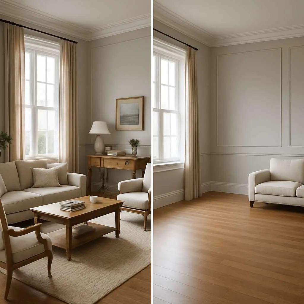
Achieving spatial balance requires understanding that negative space isn’t passive—it’s an active design element that shapes perception and movement. In my practice, I’ve observed how strategic emptiness can make a 500-square-foot apartment feel more spacious than a poorly planned 2,000-square-foot home. The secret lies in understanding visual weight and how emptiness can counterbalance density.
Visual weight operates on principles similar to physical weight. A small, dark object can balance a large, light one across a fulcrum. Similarly, a concentrated area of design elements can be balanced by an expansive area of negative space. This isn’t just about symmetry—asymmetrical balance often creates more dynamic and interesting compositions.
When designing transitional spaces, I think of negative space as the pause between musical notes. Without these pauses, music becomes noise. Without transitional emptiness, spaces become overwhelming. The hallway that connects your living room to your bedroom isn’t just circulation—it’s a decompression chamber that allows your mind to shift between different modes of being.
Consider the entrance to your home. This transitional space sets the emotional tone for everything that follows. A cluttered entryway creates immediate stress, while a thoughtfully empty one provides a moment of mental transition from the outside world to your personal sanctuary. The negative space here isn’t wasted—it’s working overtime to facilitate psychological transition.
The Art of Subtle Design
Subtlety in design requires confidence—the confidence to resist the urge to fill every corner, to trust that less can indeed be more. This principle challenges our natural instincts. We’re programmed to equate fullness with value, yet in design, restraint often creates the most profound impact.
I remember visiting a gallery where a single painting hung on an otherwise empty white wall. The painting wasn’t particularly large or colorful, yet it commanded the entire room. The negative space around it didn’t diminish its presence—it amplified it. This is the power of subtle design: allowing individual elements to achieve their full potential by giving them room to breathe.
Subtle design doesn’t mean boring design. It means intentional design. Every element that remains serves a purpose, and every element removed creates space for that purpose to be fulfilled. This approach requires deep understanding of your design goals and the courage to eliminate anything that doesn’t serve them.
The most successful minimalist spaces I’ve created aren’t empty—they’re edited. Like a well-written sentence where every word matters, these spaces contain only what’s essential, but that essence is allowed to shine with full intensity. The negative space becomes a spotlight, directing attention to what truly matters.

Design Minimalism as Movement Philosophy
Design minimalism extends beyond aesthetics—it’s a philosophy of intentional living that challenges our relationship with material culture. When we embrace minimalism in our spaces, we’re making a statement about what we value and how we want to live. This isn’t about deprivation; it’s about clarity.
The minimalist movement gained momentum as a response to overconsumption and visual overwhelm. Pioneers like Donald Judd and Agnes Martin weren’t just creating art—they were proposing a different way of seeing and being. Their work demonstrated that reduction could be expansion, that less could be more profound.
In contemporary design, this philosophy manifests as spaces that prioritize experience over possession. A minimalist living room isn’t empty because the owner can’t afford furniture—it’s curated because the owner values the experience of space itself. The negative space becomes the primary feature, not the absence of features.
This approach requires us to question everything we think we know about comfort and luxury. Is a room more comfortable when it’s filled with options, or when it’s optimized for its primary function? Is luxury about having everything, or about having exactly what you need, perfectly executed?
Marie Kondo’s influence on spatial design extends beyond organization—she’s taught us to see our possessions as either contributing to or detracting from our well-being. When we apply this lens to negative space, we begin to see emptiness not as lack but as potential for joy, clarity, and peace.
Transitional Spaces: The Unsung Heroes
Transitional spaces are the commas in the sentence of architecture—small but essential for comprehension. These areas between destinations serve multiple functions: they provide psychological decompression, physical transition, and spatial rhythm. Yet they’re often overlooked in design planning, treated as necessary evils rather than opportunities.
The power of transitional spaces lies in their ability to reset our mental state. When you walk from a busy kitchen into a quiet hallway before entering a peaceful bedroom, that hallway isn’t just circulation—it’s a mental gear shift. The negative space in these areas allows our minds to process the transition between different types of activities and energy levels.
In traditional Japanese architecture, the concept of the engawa—a transitional space between interior and exterior—demonstrates how these areas can become the most cherished parts of a home. These spaces aren’t fully inside or outside, creating a unique environment that belongs entirely to neither category. The negative space here isn’t empty—it’s pregnant with possibility.
Modern architecture often eliminates transitional spaces in favor of “efficiency,” but this approach misses their psychological value. A home without transitional spaces can feel jarring, like a song without rests between movements. The negative space in these areas provides essential breathing room for both the architecture and its inhabitants.
Consider the difference between a house where the front door opens directly into the living room versus one with a proper entryway. The latter provides a moment of transition, a space to mentally shift from public to private mode. This transitional negative space serves a crucial psychological function that can’t be measured in square footage but profoundly impacts daily experience.

Curvspace: Redefining Spatial Relationships

At Curvspace, we’ve developed a unique approach to negative space that goes beyond traditional minimalism. Our philosophy recognizes that emptiness isn’t uniform—it has texture, temperature, and personality. The negative space in a meditation room feels different from the negative space in a gallery, even if they’re physically similar.
Our projects demonstrate how negative space can be designed rather than simply left over. We consider the quality of emptiness as carefully as we consider the quality of filled space. This means thinking about how light moves through empty areas, how sound behaves in them, and how they make people feel as they move through them.
One of our recent projects involved transforming a cramped urban apartment into a spacious-feeling home by strategically removing walls and creating flowing negative space. The square footage didn’t change, but the experience of space expanded dramatically. The key was understanding that negative space isn’t just about what you take away—it’s about what you reveal.
We’ve found that the most successful spaces create a dialogue between positive and negative elements. The furniture doesn’t just sit in the room—it converses with the emptiness around it. The walls don’t just contain space—they sculpt it. This approach requires seeing negative space as a material to be shaped rather than a void to be filled.
Our clients often express surprise at how much more relaxed they feel in their redesigned spaces. This isn’t just about having less stuff—it’s about having space that actively promotes well-being through thoughtful use of negative space. The emptiness becomes a design feature that enhances rather than diminishes the living experience.
The Science of Spatial Perception
Recent neuroscience research reveals fascinating insights about how our brains process negative space. When we encounter emptiness in design, our visual cortex doesn’t simply ignore it—it actively processes it as meaningful information. This explains why well-designed negative space feels intentional while poorly planned emptiness feels neglected.
Studies using eye-tracking technology show that people’s gaze patterns change dramatically in spaces with different negative space ratios. In cluttered environments, eyes dart frantically between competing elements, creating mental fatigue. In spaces with thoughtful negative space, eye movements become more fluid and relaxed, corresponding to reduced stress indicators.
The concept of “visual breathing room” has literal neurological correlates. When our visual field contains appropriate amounts of negative space, our brains can process information more efficiently, leading to improved decision-making and reduced cognitive load. This isn’t just design theory—it’s measurable brain science.
Interestingly, cultural background significantly influences how people perceive and respond to negative space. Western cultures, with their emphasis on efficiency and productivity, often initially resist emptiness as “wasted space.” Eastern cultures, with philosophical traditions that value emptiness as potential, tend to embrace negative space more readily.
These cultural differences highlight an important point: negative space isn’t universally perceived the same way. Effective design must consider the cultural context and personal associations of the people who will inhabit the space. What feels peaceful to one person might feel stark to another.
Practical Applications in Modern Design

Implementing negative space effectively requires understanding its various manifestations and applications. In residential design, negative space might appear as the clear surface of a dining table that allows a single centerpiece to command attention, or as the empty wall space that makes a piece of art feel more significant.
In commercial spaces, negative space serves different functions. A retail environment might use negative space to create breathing room between product displays, allowing customers to focus on individual items without feeling overwhelmed. A restaurant might use negative space to create intimate conversation areas within a larger dining room.
The digital realm offers unique opportunities for negative space application. Website design that embraces white space creates more engaging user experiences, while cluttered interfaces drive users away. The principles remain the same whether we’re designing physical or digital spaces: negative space guides attention and creates hierarchy.
Lighting plays a crucial role in defining negative space. The same empty area can feel warm and inviting or cold and stark depending on how it’s illuminated. Natural light tends to make negative space feel more alive and dynamic, while harsh artificial light can make it feel sterile.
Color also affects how we perceive negative space. White walls create one type of emptiness, while deep blue walls create another. The emotional quality of negative space can be fine-tuned through careful color selection, allowing designers to create specific moods and atmospheres.
Challenges and Common Misconceptions
One of the biggest challenges in implementing negative space is overcoming the “more is better” mentality that pervades much of contemporary culture. Clients often worry that empty space represents wasted money or missed opportunities. Educating them about the value of negative space requires demonstrating its functional and emotional benefits.
Another common misconception is that negative space equals boring space. In reality, well-designed negative space can be more dynamic and interesting than cluttered areas. The key is understanding that emptiness isn’t the absence of design—it’s a design choice that requires as much thought and intention as any other element.
Budget constraints can also challenge negative space implementation. It’s often easier to justify spending money on visible elements than on the spaces between them. However, many negative space improvements cost nothing more than the discipline to remove rather than add.
Maintenance concerns sometimes discourage negative space adoption. People worry that empty surfaces will show dust or that sparse rooms will feel cold. These concerns can be addressed through material selection and strategic placement of a few high-quality elements rather than many mediocre ones.
The fear of appearing pretentious or minimalist-trendy can also inhibit negative space adoption. It’s important to distinguish between following a trend and making thoughtful design choices. Negative space should serve the inhabitants’ needs, not make a style statement.
Future Directions in Spatial Design
As our understanding of environmental psychology deepens, negative space will likely play an increasingly important role in design. Research into biophilic design suggests that humans have an innate need for certain types of spatial experiences, including the sense of refuge that well-designed negative space can provide.
Technology is opening new possibilities for dynamic negative space. Smart glass that can switch from transparent to opaque allows spaces to transform their negative space qualities throughout the day. Programmable lighting can redefine the boundaries and character of empty areas in real-time.
Virtual and augmented reality are changing how we conceptualize space entirely. In digital environments, negative space can have properties impossible in physical reality—it can change color, emit sound, or respond to user presence. These possibilities will likely influence how we think about negative space in physical environments.
Sustainability concerns are also driving interest in negative space. Smaller, more efficiently designed spaces that maximize the impact of negative space can reduce environmental footprints while maintaining or improving quality of life. This approach aligns with growing awareness of the environmental costs of overconsumption.
The aging population will likely drive demand for spaces that use negative space to enhance accessibility and safety. Clear sightlines, uncluttered pathways, and simplified environments become increasingly important as physical and cognitive abilities change with age.
People Also Ask
How much negative space is too much in a room?
The optimal amount of negative space depends on the room’s function and the inhabitants’ preferences. Generally, 30-50% negative space creates balance, but meditation rooms might benefit from more while social spaces might need less. The key is ensuring the space serves its intended purpose effectively.
Can negative space work in small apartments?
Absolutely. Small spaces often benefit most from strategic negative space because it creates the illusion of larger areas. Focus on vertical negative space, clear sightlines, and multifunctional furniture that maintains visual breathing room when not in use.
How do I convince family members who prefer fuller spaces?
Start small with one area, like a bedside table or entryway. Demonstrate the benefits through experience rather than argument. Show how negative space reduces cleaning time, makes finding things easier, and creates a more peaceful environment. Gradual implementation often works better than dramatic changes.
Conclusion
Mastering negative space transforms design from decoration to intentional experience creation. At Curvspace, we believe emptiness isn’t absence—it’s potential waiting to be realized. Ready to discover how strategic emptiness can revolutionize your space? Contact us today to begin your journey toward more thoughtful, impactful design.
References
- Environmental Psychology Research Institute. “Cognitive Load and Spatial Design.” Journal of Environmental Psychology, 2023.
- Specialty Hardware. “Minimalism: The Positive Effects of Negative Space.” 2024.
- NCL Urban Design. “The What’s of Transition Spaces.” 2022.
- ArchAdemia. “Exploring the Balance in Architectural Design.” 2025.
- Canva Design School. “50 Examples of Negative Space Design.” 2022.
- Emily Lightly. “The Empty Room: A Metaphor for Minimalism.” 2018.
- Tubik Studio. “Negative Space in Design: Tips and Best Practices.” 2024.
- Design4Users. “Negative Space in Design: What It Is and How To Use It.” 2025.
- IllustrArch. “Boost Productivity: Discover the Benefits of Minimalist Design.” 2024.
- Archeetect. “Balance in Architecture: Achieving Harmony.” 2023.
Disclosure
Our content is reader-supported. This means if you click on some of our links, then we may earn a commission. Commissions do not affect our editor’s opinions or evaluations. Learn more about our editorial process.
About the Editorial Staff
The Curvspace editorial team comprises a diverse group of experts on intermediate and threshold spaces in homes and workplaces. Architects and interior designers, civil engineers and artists, environmental and behavioral psychologists, sociologists and anthropologists. All collaborate to create helpful content, that explores the full potential of these often-overlooked areas to enhance our daily lives.
