
My work in minimalist design has shown me that negative space communicates more than mere absence. At Curvspace, we use subtle spatial cues to gently guide movement and influence atmosphere.
Jump to:
The Essence of Emptiness: Defining Negative Space
So, what exactly is this elusive “negative space”? You might also hear it called “white space,” though it doesn’t necessarily have to be white. Essentially, it’s the area in a design that is left unmarked – the space around, between, and even within the main elements. Think of it as the breathing room for all the objects on a page, screen, or in a physical environment. It’s far from being just “empty”; it’s an active and vital design element that defines the boundaries of objects and creates essential connections between them, often drawing on Gestalt principles of perception.
We can break negative space down into two main types:
- Macro negative space: This refers to the larger empty areas between major layout elements, like the space between large blocks of text and images on a webpage, or the open areas in a room.
- Micro negative space: This is the smaller spacing, such as the space between lines of text (leading), between letters (kerning and tracking), or the margins around an image.
Both macro and micro negative space work together to create a cohesive and understandable design. My personal realization came when I started thinking of it like the pauses in music or the breath between words – utterly essential for the message to land with clarity and impact. Without those pauses, music would be a cacophony, and speech would be an unintelligible rush of sound. Similarly, without negative space, designs become cluttered and overwhelming
The Psychology of Perception: How Negative Space Speaks to Us

Negative space isn’t just an aesthetic choice; it has a profound psychological impact on how we perceive and interact with a design. It’s a subtle director, guiding the viewer’s focus without overt commands. By strategically leaving areas empty, designers can draw attention to key elements – a call-to-action button, a striking image, or a crucial piece of information. This is because the absence of content in one area naturally makes the content in another area more prominent.
Furthermore, negative space can evoke specific emotions. Ample negative space often conveys a sense of calmness, sophistication, and luxury, while tightly packed elements can create feelings of energy, urgency, or even stress. It plays a crucial role in creating contrast; the “empty” areas make the “filled” areas stand out, much like silence makes sound more noticeable. This contrast is fundamental for establishing a clear visual hierarchy, helping users understand the relative importance of different elements on a page or in a space.
One of the most significant cognitive benefits of negative space is its ability to reduce cognitive load. When a design is cluttered, our brains have to work harder to process the information. Negative space simplifies the visual field, making it easier for us to scan, comprehend, and retain information. Our brains are also wired to find patterns and make sense of what we see, often “filling in” or interpreting negative space to perceive shapes or forms that aren’t explicitly drawn. Think about how a spotlight works – it’s the darkness around it that makes the illuminated subject so compelling. Negative space does that for design elements, making them shine.
Negative Space vs. Positive Space: A Symbiotic Relationship
In design, “positive space” refers to the main subjects or elements of focus, while negative space is the area surrounding them. These two are not in opposition; rather, they exist in a symbiotic relationship, like the ancient concept of yin and yang. One defines the other. The shape of an object (positive space) is perceived because of the empty space (negative space) around it, and vice-versa.
Achieving a harmonious balance between positive and negative space is crucial for a visually appealing and effective design. Too much positive space with too little negative space leads to clutter and confusion. Conversely, too much negative space might make a design feel sparse or unfinished, though this is often a deliberate choice in minimalist aesthetics. The interplay between these two creates rhythm, balance, and flow, guiding the eye and enhancing the overall user experience. It’s a dance, really. One can’t exist meaningfully without the other. At Curvspace, we see them as equal partners in crafting an experience, ensuring that both the “filled” and the “unfilled” contribute to the overall narrative and functionality of a space.
The Philosophy of “Less is More” in Minimalist Design
This brings us naturally to the concept of minimalist design, an approach where negative space isn’t just a consideration but a cornerstone. The philosophy behind minimalist design is to achieve impactful simplicity, harmony, and balance by stripping away the superfluous. It’s about intentionality. As the famous architect Ludwig Mies van der Rohe put it, “Less is more”. This isn’t about emptiness for its own sake, but about amplifying the power of the essential. Leonardo da Vinci is also famously quoted as saying, “Simplicity is the ultimate sophistication,” a sentiment that perfectly captures the minimalist ideal.
Designers embracing minimalism carefully consider the placement and purpose of every single element, ensuring that each one serves a specific function. If an element doesn’t contribute to the core message or improve usability, it’s often removed. This thoughtful, deliberate approach aims to create a sense of calmness and elegance, promoting clarity and ease of use. My work in minimalist design has shown me repeatedly that eliminating excess allows users to focus on a design’s core purpose without distraction. I often ask myself, ‘Does this element truly serve a purpose, or is it just noise?’ That’s the minimalist design ethos in a nutshell. This approach isn’t merely aesthetic; it reflects a mindset of mindfulness and a commitment to delivering what truly matters.
Key Elements of Minimalist Design
Minimalist design is characterized by several distinct elements that work together to create its signature clean and uncluttered look:
- Strategic Use of Negative Space: As we’ve discussed, negative space is paramount in minimalist design. It’s used generously to create breathing room, reduce cognitive load, and highlight the most important elements.
- Clean Lines and Uncluttered Layouts: Simplicity in form is key. Layouts are often grid-based, with a clear structure and a lack of ornamentation.
- Limited and Deliberate Color Palettes: Minimalist designs typically stick to a narrow palette, often featuring monochromatic schemes, neutrals, or a few carefully chosen accent colors to create visual hierarchy and draw attention where needed.
- Bold and Purposeful Typography: Fonts are chosen for their clarity and readability. Typography often becomes a significant design element in itself, with careful attention to hierarchy, size, and spacing.
- High-Quality, Intentional Imagery: When images or visuals are used, they are high-impact and directly support the message. Every image has a clear purpose and isn’t just decorative filler.
Imagine walking into a meticulously organized room versus a cluttered one. Which one allows you to think, to breathe, to focus? That’s the power we aim to harness with minimalist design. It’s about creating an environment, whether digital or physical, that feels intuitive and effortless.

Minimalist Design and User Engagement: A Surprising Connection
It might seem counterintuitive – how can less lead to more engagement? But minimalist design has a unique ability to capture and hold users’ attention precisely because of its simplicity and clarity. By removing distractions and presenting information concisely, it helps users quickly grasp the intended message or complete a task. This is particularly effective for conveying important information or calls to action.
Minimalist designs can also evoke a sense of elegance and sophistication. The careful curation of elements and the generous use of negative space not only enhance visual appeal but also create a sense of harmony that resonates with users, often on a subconscious level. This aesthetic refinement can elevate the overall user experience, making it more memorable and enjoyable. When a design is intuitive and easy to navigate, users feel more in control and less frustrated, leading to deeper engagement and a more positive perception of the brand or product. It might seem like a paradox—less stuff, more engagement? But by removing distractions, we allow users to connect more deeply with what truly matters. This focus often translates into higher usability and a more satisfying interaction.
Subtle Impressions: The Power of Understated Design Cues
The real magic of negative space and minimalist design lies in their ability to create subtle impressions. These are the non-verbal messages, the feelings, and the intuitive understandings that a design imparts without explicitly stating anything. At Curvspace, we believe these subtle impressions are incredibly powerful in shaping how people perceive and interact with a space or interface.
How Negative Space Creates Subtle Impressions
Negative space is a master of subtle communication. It guides the eye without shouting for attention, creating natural pathways and visual flow that lead users through content or a physical environment. The amount and placement of negative space can significantly influence the mood and atmosphere of a design. Ample, balanced negative space can create a feeling of calm, openness, and luxury, while compressed space might evoke energy or urgency.
Beyond mood, these spatial cues can subtly convey core brand values. A design that uses negative space generously and precisely can communicate professionalism, quality, and attention to detail. Think of brands like Apple or Mercedes Benz; their use of negative space contributes to a perception of sophistication and premium quality. It’s like an unspoken language. The way elements are spaced can communicate luxury, or playfulness, or seriousness, all without a single word. These are the design cues that build an initial feeling, a subtle impression that sticks.
Spatial Guidance: Navigating with Negative Space
One of the most practical applications of negative space is in spatial guidance – how it helps us navigate both digital and physical environments.
- In Web Design: Strategic use of negative space is crucial for organizing content, improving readability, and ensuring a seamless user journey. It separates blocks of text, distinguishes different sections of a page, and makes calls-to-action stand out. Websites like Google, with its famously sparse homepage, or Medium, known for its readable article layouts, are prime examples of using negative space for effective spatial guidance.
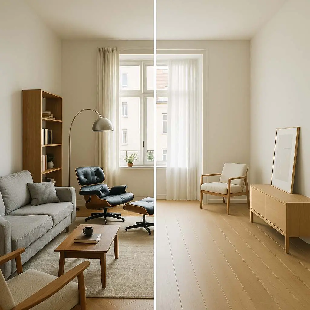
- In Architecture: Negative space defines how we experience a building and its surroundings. The voids, courtyards, atriums, and even the space between buildings shape our movement, focus, and interaction within the built environment. It can create areas for rest, contemplation, or social gathering, fostering connections between people and the space itself. At Curvspace, when we design communal areas, we’re constantly thinking about how people will move through them. Negative space isn’t just about what’s empty; it’s about creating intuitive pathways and comfortable zones for interaction.
- In Signage: Even in something as straightforward as signage, negative space plays a role. It enhances legibility by creating contrast between the text/graphics and the background, and it can give a sign a more refined, less cluttered appearance, making its message easier to absorb quickly.

Impactful Simplicity: Achieving More with Less

In a world saturated with information and visual stimuli, impactful simplicity stands out. Designs that embrace minimalism and make judicious use of negative space often cut through the noise more effectively than their more ornate counterparts. This isn’t just about looking clean; it’s about communicating with greater force and clarity.
Simplicity can be inherently more memorable. When there are fewer elements to process, the core message or the key features are more likely to stick in the user’s mind. There’s an understated elegance to designs that achieve their goals with an economy of means. This approach conveys confidence and sophistication. It suggests that the product or service is so strong that it doesn’t need excessive embellishment to prove its worth.
It’s often the quietest voice in the room that carries the most weight. Similarly, a design that whispers through its impactful simplicity can leave a more profound and lasting impression than one that shouts. I’m always inspired by designers like Jack Butcher of Visualize Value, who masterfully distills complex ideas into incredibly simple, yet powerful visual metaphors. His work is a testament to how “less” can indeed be “more” when executed with intention and skill. This is the kind of impactful simplicity we strive for, creating understated designs that resonate deeply.
Negative Space in Practice: Across Disciplines
The power of negative space isn’t confined to one area of design; its principles are universally applicable, creating subtle impressions and guiding experiences across a multitude of fields.
Architecture: Shaping Experiences Through Voids
In architecture, negative space – the voids, the gaps, the open areas – is as important as the solid structures themselves. Architects use these “empty” spaces to define function, evoke emotion, and shape how we interact with buildings and landscapes. Think of the grand, soaring atrium of a museum; the quiet, contemplative courtyard of a traditional Japanese Zen garden like Ryoan-ji; or the poignant, empty voids in Daniel Libeskind’s Jewish Museum in Berlin, which speak volumes about absence and memory. These spaces are not passive backdrops; they actively engage our senses, encourage movement, foster connections, and create a sense of harmony, balance, or even intentional tension.
Frank Gehry’s Guggenheim Museum in Bilbao is a fantastic example. The expansive voids around and within its sculptural forms create a dynamic dialogue with the urban environment, offering places for connection and introspection. Similarly, projects like The High Line in New York City demonstrate how negative space can be repurposed to become a catalyst for social interaction and community engagement, turning an abandoned railway into a vibrant urban park. When I walk through a well-designed building, I often pay as much attention to the spaces between the walls as to the walls themselves. That’s where life unfolds, where movement happens, and where the character of the building truly reveals itself.
Graphic Design & Branding: Crafting Identity with Emptiness
In graphic design and branding, negative space is a powerful tool for creating memorable identities and conveying complex messages with elegant simplicity. Many iconic logos cleverly utilize negative space to embed hidden meanings or create dual imagery. The most famous example is probably the arrow hidden between the ‘E’ and ‘x’ in the FedEx logo, subtly suggesting forward movement and efficiency. The Apple logo, the Nike swoosh – these are powerful symbols that leverage simplicity and the careful balance of positive and negative space to achieve global recognition.
Negative space helps to make logos and brand visuals more distinctive and memorable. It can also contribute to the overall perception of a brand. For instance, luxury brands often use ample negative space in their advertising and packaging to convey sophistication, exclusivity, and quality. The way negative space is handled can make a brand feel modern and clean, or classic and timeless. It’s a subtle but potent ingredient in the brand’s visual storytelling. The FedEx arrow is a classic for a reason! It’s a delightful surprise, a subtle impression that speaks volumes. That’s the magic we aim for.
Web and UI/UX Design: Enhancing Digital Journeys
For those of us designing digital experiences, negative space is absolutely fundamental to good UI/UX design. It’s what makes interfaces usable, readable, and aesthetically pleasing. Ample white space around text and between paragraphs significantly improves readability and reduces eye strain. It helps to organize content on a page, distinguishing different sections and creating a clear visual hierarchy that guides the user’s attention to the most important elements, like headlines, key information, or call-to-action buttons.
Consistent spacing – both micro (between letters and lines) and macro (between larger blocks of content) – is crucial for creating a sense of order and predictability, which helps users build a mental model of the interface and navigate it more easily. When a webpage is too cluttered, users can feel overwhelmed and are more likely to abandon it. Strategic negative space acts like a gentle guide, leading the user through their digital journey smoothly and enjoyably. On a crowded webpage, where do your eyes go? Probably nowhere, or everywhere at once. Strategic negative space acts like a gentle guide.

Mastering the Void: Practical Tips and Creative Challenges
Understanding the theory of negative space is one thing; applying it effectively is another. It requires practice, intention, and a willingness to embrace “less” as a powerful tool.
Tips for Effectively Using Negative Space
Here are some practical tips that I’ve found useful in my own work at Curvspace and in minimalist design generally:
- Embrace Minimalism: Start by simplifying. Remove any unnecessary elements or clutter. Ask yourself if every element on the page or in the space serves a clear purpose. If not, consider removing it to let the negative space take center stage.
- Maintain Consistent Spacing: Consistency in your use of negative space (margins, padding, line spacing) creates a sense of harmony, professionalism, and balance. This helps users build a mental model of your interface or intuitively understand a physical layout.
- Use Negative Space Strategically to Highlight: Put more space around crucial information or call-to-action buttons to draw the user’s attention and guide them towards desired actions. The “emptiness” around an element makes it more prominent.
- Balance Micro and Macro Negative Space: Pay attention to both the large empty areas (macro) and the smaller gaps within and between elements (micro). Achieving an effective balance between these two creates a visually appealing and organized layout.
- Strike the Right Balance: This is key. Too much negative space can make a design feel empty or disconnected, while too little can make it look cluttered and overwhelming. Aim for a harmonious composition that lets the content breathe.
- Consider Material and Lighting (for physical design): In physical spaces or objects like signage, the natural texture of materials can act as a subtle form of negative space. Lighting also dramatically affects how negative space is perceived, with soft lighting often accentuating subtleties.
It’s a bit like seasoning food. Too little, and it’s bland; too much, and it’s overpowering. The art lies in finding that perfect balance where every element, including the space around it, enhances the overall “flavor” of the design.
Common Pitfalls to Avoid
While powerful, negative space can be misused. Here are a few common traps:
- Thinking of it as “Wasted” Space: Perhaps the biggest mistake is seeing negative space as merely “empty” or a missed opportunity to cram in more content. This undervalues its critical role in balance and clarity.
- Over-Cluttering: The urge to fill every available bit of space to provide “more information” often backfires, leading to designs that are overwhelming and difficult to use.
- Bad Prioritization and Imbalance: Misplaced or poorly thought-out negative space can disrupt visual flow, drawing attention to unimportant elements or making some areas feel overcrowded while others seem barren.
- Ignoring Context or Surroundings: A design choice for negative space might look good in isolation but clash with its environment or other design elements it needs to coexist with.
- Inconsistency: Applying negative space erratically across a website, brand materials, or different areas of a physical space can undermine cohesion and professionalism.
One of the most common mistakes I see designers make is fearing the void. They try to fill every nook and cranny, and the design ends up feeling suffocating rather than inviting. Don’t be afraid to let your designs breathe! Often, the solution to a design problem isn’t adding more, but taking something away.
Creative Exercise: The “Subtraction Challenge”
To truly appreciate the power of negative space and impactful simplicity, I often recommend a simple exercise I call the “Subtraction Challenge.” It’s a great way to develop your eye for what’s essential:
- Choose a Design: Take an existing design you’re working on—a webpage layout, a presentation slide, a poster, even the arrangement of furniture in a room.
- Start Removing: One by one, remove elements from the design.
- Ask Critical Questions: With each removal, ask yourself:
- Does its absence improve clarity or focus?
- Does the core message become stronger or weaker?
- Is the design easier or harder to understand/navigate?
- Does it feel more or less impactful?
- Find the Core: Continue this process until removing another element genuinely diminishes the design’s effectiveness or its intended message. You’ll often be surprised how much can be removed before this point is reached.
Try this yourself: you’ll be amazed at how often less truly becomes more, leading to impactful simplicity. It’s a fantastic way to train your minimalist design instincts.
Sparking Creativity: Questions to Ponder
To further engage with the concept of negative space and its potential, I find it helpful to ask open-ended questions. These can spark new ideas and encourage lateral thinking, whether you’re a designer or just someone interested in how subtle impressions shape our world:
- How can the absence of an element communicate more effectively than its presence?
- In what ways can negative space transform an ordinary experience into an extraordinary one? Think about a favorite park, a beautifully designed app, or a piece of art that moved you.
- If negative space had a voice, what would it be saying in your current project or a space you frequent? Is it whispering calm, shouting for attention, or guiding you gently?
- Beyond visual design, where else in life or work could the strategic use of “emptiness” or “pause” lead to better outcomes? Kate Eastridge, in an article for Motherhood Unstressed, beautifully highlights the importance of making room for negative space in our busy lives, not just in design, for inspiration and creativity. This could mean moments of quiet in your day, uncluttered thinking time, or even silence in a conversation to allow for deeper reflection.
I find these questions incredibly useful in my own work at Curvspace. They push me to think beyond the obvious and explore the deeper, subtle impressions our designs can make, ultimately aiming for more intuitive and meaningful spatial guidance.
The Future of Design: Evolving with Negative Space

As our world becomes increasingly saturated with information and stimuli, the principles of negative space and minimalist design are not just enduring; they are becoming even more critical.
Negative Space in the Age of Information Overload
We are constantly bombarded with notifications, advertisements, and an endless stream of content. In this context, designs that embrace negative space offer a visual and cognitive respite. They provide a moment of calm, a place for the eye and mind to rest, making them inherently more inviting and less stressful to engage with.
Minimalism and strategic negative space are powerful antidotes to digital clutter. By focusing on essential information and providing ample “breathing room,” these designs can improve concentration, reduce overwhelm, and enhance mental clarity. In a world that’s constantly shouting for our attention, a design that offers a moment of quiet, a bit of breathing room, isn’t just nice to look at – it’s a relief. It’s evolving from an aesthetic choice to a user-centric necessity.
Innovations and Trends in Using Negative Space
The application of negative space is also evolving, particularly in the digital realm. We’re seeing exciting trends emerge:
- Dynamic Negative Space: In interactive designs, negative space isn’t always static. It can adapt and change based on user interaction, screen size, or content, creating more fluid and responsive experiences.
- Personalized Spatial Guidance: Future interfaces might subtly adjust their layout and spacing based on individual user behavior or preferences, offering a truly personalized and intuitive navigation experience.
- Sustainability and “Less Material”: In physical design, the philosophy of “less is more” aligns strongly with sustainability. Using fewer materials, creating multi-functional spaces, and focusing on the quality of the void can lead to more environmentally conscious and impactful designs. The simplicity inherent in negative space-conscious design often translates to more efficient use of resources.
- Neuroscience-Informed Design: As we learn more about how the brain processes visual information, designers will be able to use negative space with even greater precision to reduce cognitive load, enhance learning, and create more emotionally resonant experiences.
We’re seeing fascinating developments where negative space isn’t static. Imagine interfaces that subtly adjust their spatial guidance based on what you’re trying to achieve, or public spaces that feel adaptable to different group sizes or activities. The potential for truly intuitive and human-centered experiences, guided by the thoughtful application of both presence and absence, is immense. At Curvspace, we’re excited to explore these frontiers, continually refining how subtle impressions and negative space can enrich the way people live, work, and connect.
People Also Ask
What is the main purpose of negative space in design?
The main purpose of negative space is to provide visual breathing room, improve readability, create balance and hierarchy, guide the user’s eye, and enhance the overall aesthetic appeal and effectiveness of a design by emphasizing key elements. It’s an active component that helps define and give form to the positive elements in a composition.
How does minimalist design utilize negative space?
Minimalist design heavily relies on negative space as a core component to achieve simplicity and clarity. By deliberately leaving areas unmarked or “empty,” it reduces visual clutter, focuses attention on essential content or functionality, and creates an elegant, uncluttered user experience that feels intuitive and calming.
Can negative space create an emotional impact?
Yes, negative space can significantly influence the emotional impact of a design. Generous and well-balanced negative space often evokes feelings of calmness, sophistication, luxury, or freedom. Conversely, a lack of negative space can make a design feel busy, energetic, or even stressful. Strategic use of negative space helps set a specific atmosphere or mood.
Conclusion
Negative space is far more than mere emptiness; it’s a dynamic and powerful tool in the designer’s arsenal. These subtle impressions, crafted through the intentional use of “the void,” are fundamental to creating minimalist designs that offer impactful simplicity. By mastering spatial guidance, we can create experiences that are not only aesthetically pleasing but also intuitive, engaging, and deeply resonant. Explore how Curvspace can help you harness these principles in your next project.
References
- TopRight. (2024). “Negative Space in Design: The Power of What’s Not There.” TopRight Design Blog.
- House of Signs Co. (2025). “Subtle Textures: When Less is More in Signage Design.” House of Signs Blog.
- Eastridge, K. (2023). “Negative Space: Making Room for What Matters.” Motherhood Unstressed Blog.
- Design4Users. (2024). “The Strategic Use of Negative Space in User Experience Design.”
- Interaction Design Foundation. (2024). “Negative Space in Design: Creating Balance and Focus.” IxDF Literature.
- Webflow. (2024). “Minimalist Design Examples: Less is More in Web Design.” Webflow Blog.
- Halo Lab. (2024). “The Power of Negative Space in Modern Design.” Halo Lab Design Blog.
- Modern Restaurant Management. (2024). “How Subtle Decor Can Really Make Your Space Stand Out.”
Disclosure
Our content is reader-supported. This means if you click on some of our links, then we may earn a commission. Commissions do not affect our editor’s opinions or evaluations. Learn more about our editorial process.
About the Editorial Staff
The Curvspace editorial team comprises a diverse group of experts on intermediate and threshold spaces in homes and workplaces. Architects and interior designers, civil engineers and artists, environmental and behavioral psychologists, sociologists and anthropologists. All collaborate to create helpful content, that explores the full potential of these often-overlooked areas to enhance our daily lives.
